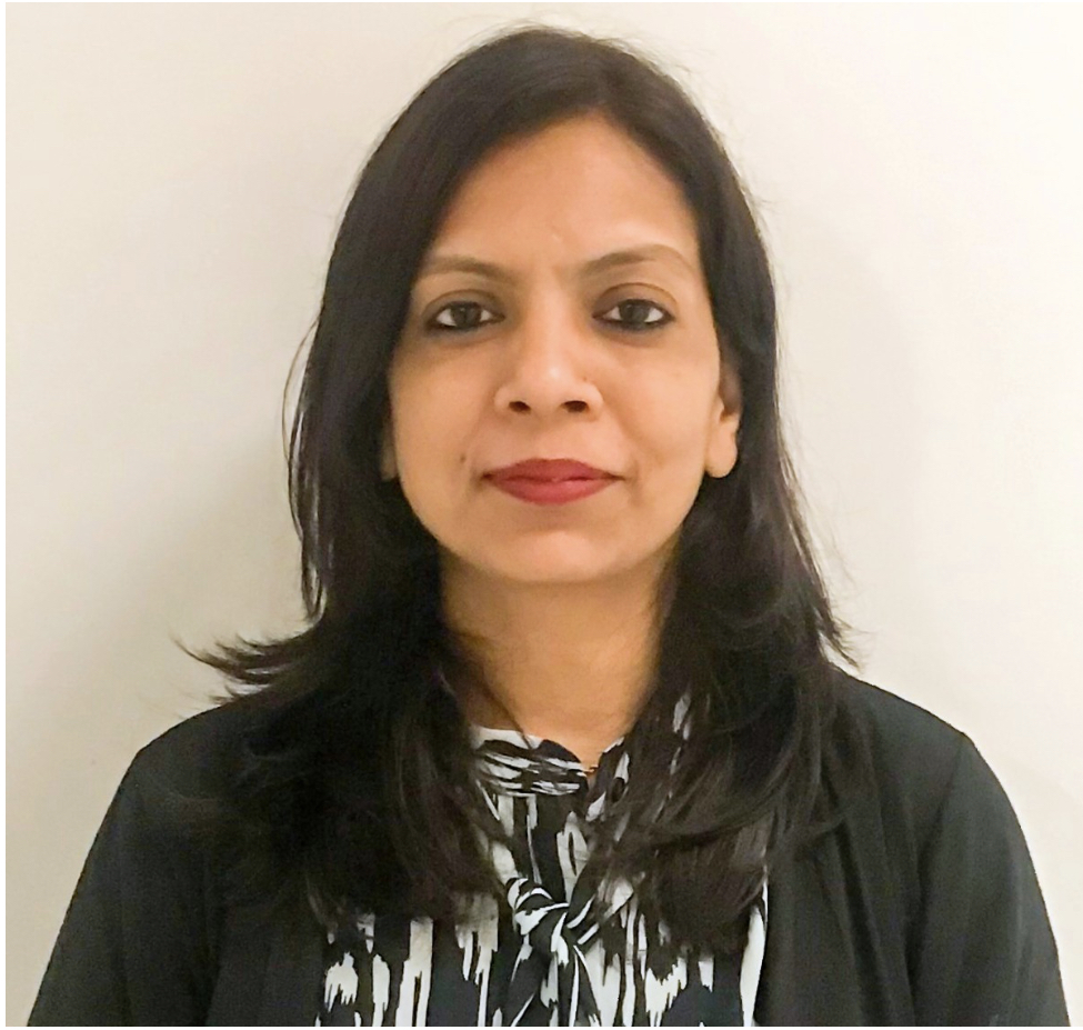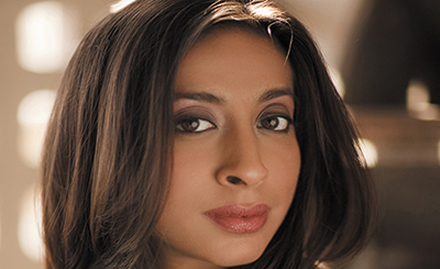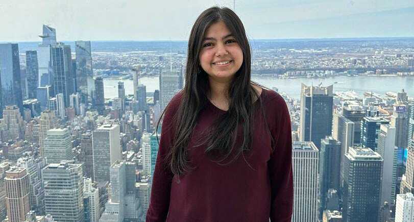
New York-based multi-disciplinary graphic and UI/UX designer and artist Tanvi Kumar. Photo courtesy of the artist-designer
To the graphic and UI/UX designer, different mediums offer various perspectives to draw from
New York-based multi-disciplinary graphic and UI/UX designer and artist Tanvi Kumar explores the intimate world of human emotions through the crystalline lens of dried tears, blending personal narratives and microscopic wonders to create a profound tapestry of shared experiences. In ‘Soaked in Tears,’ one of her deeply personal projects, Kumar collected microscopic crystals of dried tears, along with anecdotes of emotional memories from friends. As a designer, Kumar is passionate about pursuing human-centered design; her goal is to explore new avenues of design thinking and interaction to start conversations and create shared experiences, using print and digital technologies and platforms. Having moved to the US from Gurugram in 2019, she completed her Bachelors in Fine Arts from Pratt Institute in New York, with a double minor in Psychology and Interdisciplinary Book Design.
In August 2023, she volunteered as a freelance graphic designer for the Bronx River Alliance, a non-profit dedicated to preserving and enhancing the Bronx River corridor — a 23-mile green space that follows the Bronx River in New York City. She designed promotional graphics and T-shirts for the organization’s participation in the 2023 TCS NYC Marathon, where it aimed to raise $17,500. The success of this endeavour was acknowledged with a Graphic Design USA (GDUSA) award in the Designing for Good category.
Kumar, a graphic design volunteer, at Women Who Create, a non-profit that fosters connections among multicultural creative women, took the lead in branding and designing for their fifth-anniversary event, a celebration of empowerment and community, which was held in 2023. “Through my design work, I strive to do more than just visually represent ideas: I aim to actively engage, amplify, and cultivate inclusive and compassionate communities. Whether it’s through branding initiatives or storytelling pieces, I’m committed to creating meaningful experiences that resonate and inspire,” says Kumar, whose portfolio includes collaborations with clients such as The New York Times, The New York Academy of Sciences, West Wharf, SWMW Law, and Baughman Kroup Bosse, a firm of trial lawyers.
“As a human-centred designer, I see myself as a catalyst for conversations, shared experiences, and, most importantly, change. This ethos guides my work, particularly in projects with non-profit organizations like Ventana Wilderness Alliance, Bronx River Alliance, and Women Who Create,” she adds. Excerpts from an interview:
How did collecting microscopic crystals of dried tears, along with anecdotes of emotional memories from friends, influence your perception of human emotions and the importance of personal stories in your artistic oeuvre?
Soaked in Tears was inspired by the question: How can we visualize intangible, transient, and deeply personal moments and emotions? This question was sparked by the concept of Data Humanism, developed by Italian designer Giorgia Lupi. Her approach, which critiques the impersonality of a technical approach to data and encourages us to connect data to human narratives and stories, resonated deeply with me and encouraged me to explore avenues for connecting personal stories and abstract emotional experiences.
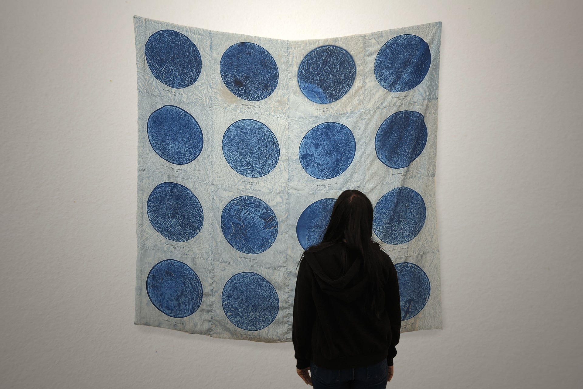
Soaked in Tears was inspired by the question: How can we visualize intangible, transient, and deeply personal moments and emotions?
Delving into the intricacies of human emotions and their manifestation led me to the subject of tears — each type, whether basal, reflex, or emotional, carrying its own unique significance. Upon discovering that tears form complex microscopic structures as they dry, each unique based on the tear’s composition and drying environment, I was intrigued by how these unique forms symbolized the individuality and internal complexity of the human feelings and emotions that often produced these tears. The project evolved as I collected and photographed the microscopic dried tears, intertwined with emotional anecdotes from my friends, metaphorically imbued and soaked into the design and material as a way of visualizing these human narratives. This process not only illuminated often hidden and transient nuances of everyday experiences, but also fostered a stronger community through shared experiences of vulnerability. Throughout this project, I discovered my interest, as a designer, in creating collective experiences and sharing narratives about ideas that might be hidden, hard to notice, or around us all the time but we haven’t paid much attention to, or hesitate to confront and reflect upon.
As someone who explores various creative mediums, including traditional forms like charcoal and ink to digital photography and motion graphics, how do you find these practices inform and enrich your graphic design and UI/UX work?
I explore and combine various creative approaches and media to expand my repertoire and deepen my understanding of design principles. Experimenting with different mediums, ranging from traditional tools like charcoal and ink, to digital forms such as photography and motion graphics, offers me a rich tapestry of perspectives to draw from. This not only strengthens my understanding of fundamental design concepts like materiality, texture, composition, and pacing, but also encourages multiple perspectives on storytelling and narrative construction. Each medium challenges me to consider the interpretation and reception of the subject and content. This process encourages me to approach themes from multiple angles, supporting a nuanced understanding and critical evaluation of the dynamic interplay between the content, the user interface, and my role as a designer — a key aspect of human-centred design. Ultimately, this creative approach enables me to craft compelling and immersive user-experiences and narratives that resonate with the audience on a deeper level.
How do you strike the balance between artistic expression and functional design principles? How do you leverage your diverse skill set to ensure that the visual components and interactive elements you design contribute effectively to enhancing user experience and engagement?
In my UI/UX projects, I strive to combine technical design principles with creative expression to craft seamless and captivating user experiences. Central to this approach is striking a balance between the functional principles and artistic innovation. The functional principles of balance, hierarchy, colour, and placement create the structural backbone of every design, dictating layout and navigation across pages, while creative expression infuses the design with unique visual moments, inspiring style, dynamism, and emotion. To ensure that visual components and interactive elements effectively enhance user experience and engagement, I prioritise understanding the brand’s narrative, as well as empathising with their audience’s goals, expertise, and pain points. By integrating these insights into the design process, I strive to create a unified, seamless, and comprehensive solution that guides users through their journey, rather than causing confusion or competing with one another. This approach fosters user engagement, and cultivates a deeper connection between the brand and its audience.
How do tackle projects for clients across a wide spectrum of industries, such as media, academia, and law, and ensure that each design effectively captures the distinct identity and message of the client?
Each client brings a distinct narrative and set of goals to the table. I prioritize gaining a deep understanding of their story, message, and target audience through direct engagement with the client and comprehensive research. This involves immersing myself in the client’s world, learning about the specific industry, and studying successful strategies in the landscape, to identify strengths, weaknesses and the white space for the brand. By understanding the client’s landscape, audience, and strategic goals, I can tailor the design to effectively capture their identity and convey their message. This ensures that each design not only aligns with the client’s brand, but also resonates with their audience, leading to connection and engagement.
Could you describe some of the most demanding projects you encountered as a Junior Designer at Strong Studio? How did you overcome challenges or creative hurdles while developing these designs? Also, what insights have you gained from these experiences that have contributed to your growth as a graphic designer?
One of the most demanding projects I am working on as Junior Designer at Strong Studio, involves branding, identity, and wayfinding for a luxury real estate client in New York City. The scale and complexity of the project has presented numerous challenges, including meeting tight deadlines and harmonising all the moving pieces, including residential wayfinding and signage, branding of the wide range of amenity spaces, and designing for various communication channels.
Collaborating closely with team members, and leveraging the expertise of each member, we navigate through the intricacies of the project and achieve technically sound functionality, and a bold, sophisticated visual design. Division of responsibilities, group reviews, and client check-ins have been essential in building and maintaining a coherent brand, keeping everyone involved at all stages of production, and meeting key project milestones. A critical part of the project is developing a comprehensive design guideline for the brand, which serves as the blueprint for ensuring consistency across all touchpoints. This experience has underscored the importance of attention to detail, strategy-driven system-based design, and adherence to established guidelines, particularly when designing physical and spatial components, like signage, where size, texture, material, legibility, and accessibility are critical.
Through this project, I have gained valuable insights into the technical aspects of design, and the importance of creating and maintaining a cohesive brand system, where each component follows a specific structure and fits under the visual identity established for the brand, while still being unique and well-designed. It has taught me to navigate fast-paced projects while upholding the integrity of the design, level of detail, and adhering to strict guidelines. Also, I have been challenged to push my macro-level systems thinking and micro-level attention to detail, contributing to my growth as a graphic designer.
How have your roles as an Interaction Design Intern at Code and Theory, and internships at Wunderman Thompson, Ernst and Young, Galleria di Lux, etc shaped your approach to UI/UX design? Could you share any specific insights or lessons gleaned from these varied internship experiences?
My diverse internships at Code and Theory, Wunderman Thompson, Ernst & Young, and Galleria di Lux, across different geographies such as India, USA, and Italy, have not only enriched my cultural understanding of design, but also honed by ability to collaborate effectively with multidisciplinary teams comprising designers, strategies, produces, project managers, and developer. Working alongside professionals with diverse backgrounds has taught me the importance of leveraging collective expertise and insights to strengthen design solutions. It has also strengthened my consideration for research, functionality, and timelines, while ensuring highest quality of design. My internships have sharpened my skills in research and strategy, allowing me to create well-informed designs that resonate with the audience and effectively convey the brand narrative.
My role as an interaction design intern helped develop my ability to balance systems level thinking with attention to detail, ensuring every individual element and component is unique and well-designed, and also contributes to a unified, flexible, and engaging modular system. Furthermore, gaining exposure to the development and production phase of projects has provided me with a foundational understanding of the practical constraints, enabling me to push the boundaries of design while keeping feasibility and usability in mind. Overall, these different internships have allowed me to experience and learn from varied work environments and teams, and develop a holistic skill set and understanding of complex design projects.
More from Arts
Comments
*Comments will be moderated
